All of these images are "mirrored." They are saved as if they had been reversed in a mirror. Regardless of if the thumbnail is or not, all of the fullsize images are reversed. This way, all you have to do is the following:
Design
#1: 90,819 bytes
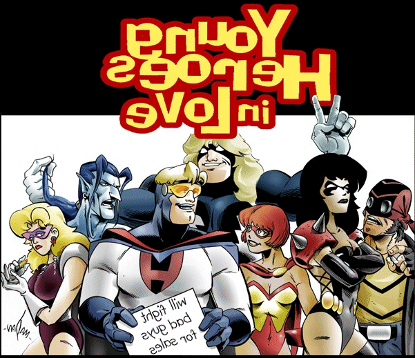 Design #2: 157,751 bytes
This is a great group shot that Madan sent me. It is really cool looking,
but I'll tell you, getting the colors to transfer well is hard. I would do
some other shirts first to warm up. The sign Hard Drive is holding says
"will fight bad guys for sales." This image is great. I used it on the
back with a text logo on the front.
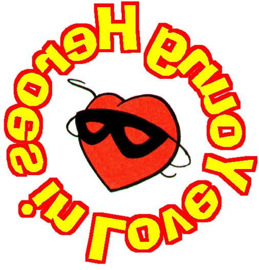 Design #3: 42,758 bytes
I was just kind of playing when this came up. I think it looks Ok, but you
probably will need to resize it a bit. It would probably make a better
breast logo than a center chest image. Might not look bad on a back, but I
dunno what you'd put on the front. I think that this is what I'm going to
use when I make the window decal for my car.
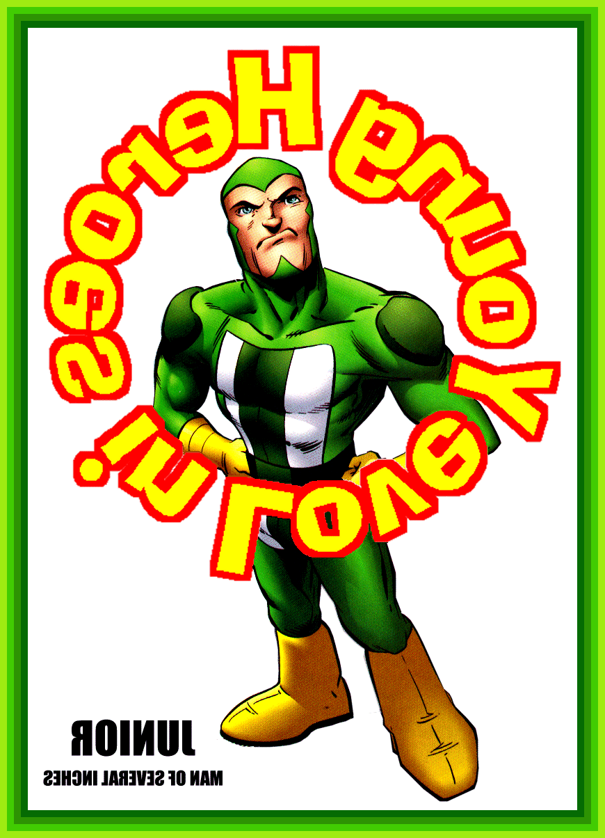 Design
#4: 200,434 bytes
Design
#4: 200,434 bytes
My friend Chip said that if I gave him a free YHIL shirt he'd wear it at
the Con. He wanted one of junior either climbing into, or riding in a
shirt pocket. This is as close as I got becasue I can't draw worth a flip,
and there were no good close up shots of junior climbing that I could
scan. I couldn't figure out how to draw a pocket, so I just slapped some
word art on it. I added the border because I thought the paper was going
to add the white as white, not transparent. Since it was going on a green
T-shirt, I thought the white could use a border. Well, it dosen't. You
can't print these things on colored T-shirts anyway, I just made a mess.
You may want to just crop the border, or cut it out when it prints. It
should look pretty snazzy on a white shirt.
 Design
#5:151,537 bytes
Design
#5:151,537 bytes
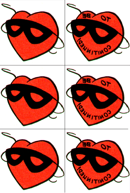
These are the little "Masked Heart" icons that end every issue. I have
kind of adopted them as the mascot of the page. They are just a really
cool graphic. The ones on the left are plain, and the ones on the right I
left the "To be continued" in them. I had thought about using them somehow
as part of the Massive Buying Campaign, but have not had time to think of
a good way to use them. That "to be continued" is just asking to be
exploited in some manner.
These were FUN! I think I might make some more!